
How a drive up the A1 becomes a study in Branding
- Jackie Fecitt

- Sep 6, 2025
- 2 min read
My in-laws live in Lancashire and every so often we take a trip to visit them.
A lot of the journey is on dual carriageway where you see so many different brands on the road and it’s a great reminder how much of an enterprising lot we are!
From supermarket giants and logistics firms to tradespeople and local businesses, removal companies, dog groomers or florists, the road is alive with logos of every shape and style.
Looking at such a wide range of logos fascinates me with their varying degrees of iconography and simplicity and I often wonder what the brief was and how they were created. Whether they were created in big agencies, solo studios, or in-house.
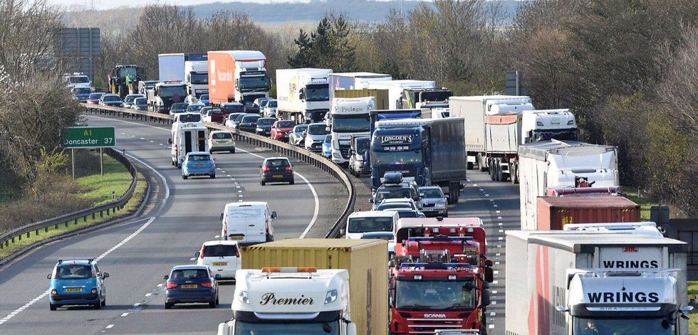
Seeing a big brand’s huge logo up close on the side of a truck where you can see every vectorised detail I feel a familiarity, knowing and understanding how they would have been created.
It’s always the simplest logos that work the best, and even better if they have a clever idea, for example where negative space creates another shape, or initials coming together to create a well-crafted icon.
Even simple word-marks where the letter spacing has been tweaked and small adjustments have been made to make it unique look styled and professional.
I also see lots of logos where I would just make a couple of tweaks to make it even simpler, smoother or more aligned. As well as some where I would love to start afresh and help re-brand them!
But whatever the brand, all the major roads in this country are basically a moving trade-show of various enterprises going about their business.
Being on the road is a great way to get your business noticed, even better if you have a well-designed logo.


Comments